Forty-four years after putting their powder blues away in the darkest corner of their uniform closet, the Chicago Cubs are bringing the colour back in a big way in 2025.
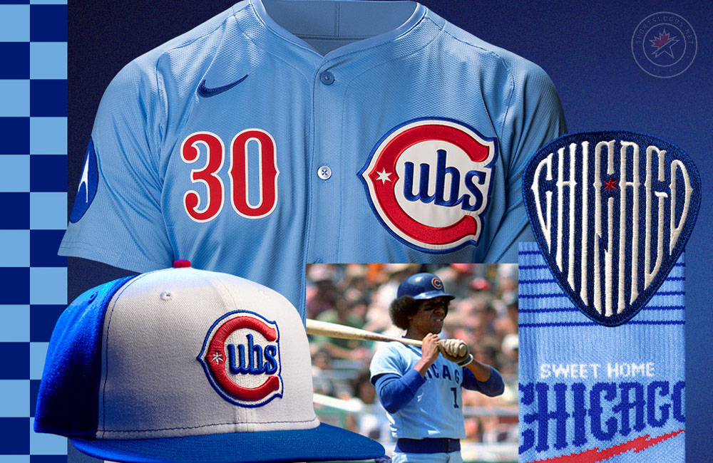
Tonight, the Cubs unveiled their new powder “Blues” alternate uniform, a design combining some past team logos with a musical tribute and introducing a few logos entirely new to the ballclub.
“The baby blues are back,” said Cubs Executive Vice President of Marketing and Communications Jennifer Martindale in the press release. “We’re thrilled to revisit this popular colourway while also paying tribute to the Blues music that has shaped our city’s cultural landscape. This uniform is more than a celebration of the Cubs past; it’s a nod to an iconic Chicago artform. We hope fans enjoy this unique blend of sports and music history.”

The jersey features a newly designed Cubs logo—a stylized red ‘C’ with a vintage flair—placed on the upper left chest of the powder blue button-up jersey. On the opposite side is the player’s number in red in a blues-era style typography. The sleeve features another new logo, a royal blue guitar pick with CHICAGO squeezed in custom lettering with the middle “C” (music term!) split by a lightning bolt, symbolizing Chicago as the birthplace of the electrified blues. A red six-pointed Chicago star appears on the guitar pick patch. A Motorola logo will be worn on the opposite sleeve. The player’s name on the back is blue, trimmed with white, and has a similar lettering style as the number on the front.
Up top, the new Chicago Cubs ballcap is a royal blue crown and visor with a white front panel and a red button. That new logo from the front of the jersey was duplicated on the front of the crown. Down below, they’ll wear powder blue socks with six thin royal blue stripes — for the six guitar strings, along with a “Sweet Home Chicago” wordmark. This is in reference to the blues song of the same name released initially by Robert Johnson in 1937, later covered by Magic Sam in the 1960s and again by The Blues Brothers in their 1980 film.

Breaking down this new logo on the chest and caps, I invite you to take a trip through time with me. We start in 1907 when the Cubs first wore this style of “C” on the front of their home tops. Back then, it was all on its own and in black. Two years later, in 1909, the Cubs added a lowercase “ubs” inside a different style, “C,” debuting what would become a familiar look for the ballclub for most of its history. Various forms of this “C” + “ubs” logo were worn over the next few decades. The “C” was made red in 1919, and a blue outline was added around the entire logo in 1941. All of this is placed on a powder blue jersey, first worn by the Cubbies on the road for the 1941 and 1942 seasons, the first time a team wore the colour as their uniform’s base in the big leagues.
Though the Cubs shelved powder blue after 1942 in favour of grey for more than three decades, the 1970s resurgence of the colour across MLB brought it back into the Cubs’ rotation in 1976, ending with a white, pinstriped powder blue set in 1981. Powder blue peaked in 1980, worn by 11 of MLB’s 26 teams (42%), before disappearing entirely by 1992. During the 2024 season, seven teams had at least one powder blue jersey in their wardrobe (Kansas City, Milwaukee, Philadelphia, St. Louis, Tampa Bay, Texas, and Toronto).

While this uniform certainly has the look, feel, and origin story of a City Connect uniform, it is, in fact, an alternate uniform—not a City Connect. It will slide alongside the Cubs’ home whites, road greys, and alternate blues as their fourth of four permitted regular uniform slots.
Between you and me, the uniform echoes the late-1970s Montreal Expos style—especially with that style of numbering on the front, most reminiscent of the era before they added racing stripes in 1981. Pairing it with the white panelled cap only adds to that feeling. This look could also serve as a fitting tribute to Hall of Famer and former Cub Andre Dawson, who wore that same uniform with the Expos early in his career.
Fans can purchase the new jersey at the Cubs Convention and the official team store at Gallagher Way on Friday. The team will wear this uniform for the first time on Saturday, April 5, 2025, when they host the San Diego Padres at Wrigley Field.
Thus far, heading into the 2025 season along with this new set for the Cubs, we’ve seen a new uniform set for the Cleveland Guardians, heard of the A’s simply swapping “Oakland” out for “Athletics” on their jerseys, and the possible addition of orange pants to the Baltimore Orioles. The league will also begin phasing out some of Nike’s changes to their uniforms last season, such as a return to larger player names.


Comments are closed