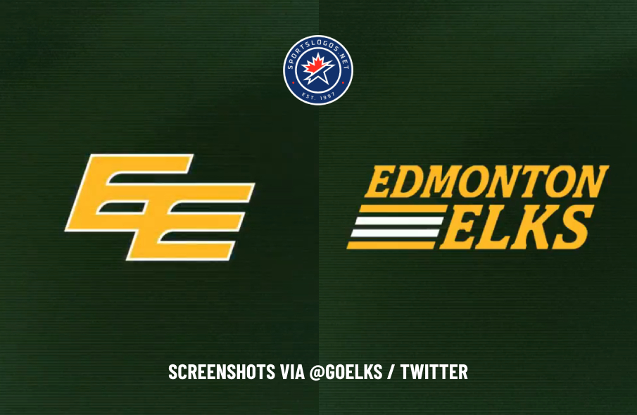
Based on posts to their social media platforms and changes to their website last week, it seems the Canadian Football League’s Edmonton Elks are following through on changes to their identity that were hinted at when a new owner took over last summer.
The Elks posted a video to their social media channels on Friday, January 3, with the caption: “Classic look, modern feel” and the hashtag #AlwaysEdmonton. The video shows the team’s gold Double-E logo with a white outline fading into view, followed by a new wordmark with “EDMONTON” and “ELKS” in a slab serif font and four stripes — two white on the inside and two gold on the outside — taking up the space to the left of “ELKS.”


The four stripes in the wordmark are a pattern that the Elks wore on their sleeves from 1966 to 1995, and again from 2012 to 2015.
A one-color version of the wordmark also now appears in the footer of the team’s website. All the team’s social media profile photos have been changed to the Double-E logo, and it also features prominently in their social media and website header images.

The moves coincide with what new Elks owner Larry Thompson said in August 2024 when he became the team’s first-ever private owner. The former owner of Thompson Brothers Construction in Edmonton and lifelong fan of the team didn’t have a lot to say at the time, but did say during a press conference that the classic Double-E logo would drive the team’s branding efforts going forward.
In an interview with TSN’s Ryan Rishaug after the press conference, Thompson said, ““The Double E is not a change from anything. The team is still going to be the Elks. We’re going to focus on the Double E more in the future.”
“So Elks likely will remain, but the Double E more likely is the focus of the branding and such?” Rishaug asked. Thompson replied, “Correct, yeah.”
The team first announced it would change its name in July 2020. In June 2021, they officially changed their name to the Elks and unveiled a new logo. They wore yellow helmets with green antlers on the sides for one season, but then switched back to the Double-E logo on their helmets.


Comments are closed