The host countries for two more men’s FIFA World Cups are set — now begins the speculation on what their tournament logos could look like.
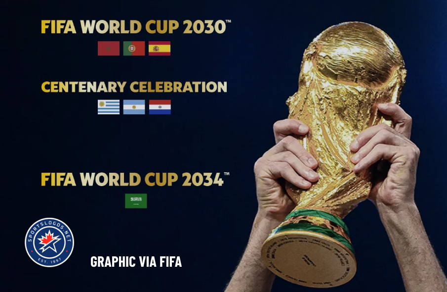
On Wednesday, December 11, FIFA officially awarded the 2030 World Cup to a joint bid from Spain, Morocco and Portugal, while also officially awarding the 2034 World Cup to Saudi Arabia. Both bids were uncontested and were confirmed by acclamation at a meeting of more than 200 member federations at a FIFA extraordinary congress.
“In today’s divided world, where it seems that nobody can agree any more on anything, to be able to agree on something like that is definitely an incredible message of unity and positivity. And, we need these messages today,” FIFA president Gianni Infantino said.
Along with the three countries in the 2030 bid, Paraguay, Uruguay and Argentina will all host one match each to celebrate the 100th anniversary of the first World Cup, which was held in — and won by — Uruguay.
Until now, the respective bid committees have been operating under bid logos. But recent history shows that the bid logos don’t necessarily line up with the tournament logos. This is mostly due to FIFA regulations and templates.

When the 2026 World Cup logo was unveiled in May 2023, FIFA seemed to suggest that it would be the basis for a new World Cup logo template going forward, with a photorealistic depiction of the World Cup trophy as the centerpiece.
For the first time in history, an image of the actual trophy and the tournament hosting year is being depicted, forming an innovative design language that anchors the FIFA World Cup™ emblem for 2026 and beyond. The image of the trophy and the year allow for customisation to reflect the uniqueness of each host, while building an identifiable brand structure for years to come.
— FIFA.com

“The Official Brand introduces fans to the tournament’s new emblem, typeface and striking colour palette, three exciting elements that will bring this tournament to life in the coming months and years,” added Romy Gai, FIFA’s chief business officer, at the time.
What do you think the 2030 and 2034 World Cup logos should look like? What local elements from the host nations would you like to see incorporated? Let us know in the comments!


Comments are closed